Friday 21 September 2012

Unaware on Pride Hill

The brief was to develop confidence and technique by photographing people unaware.  I felt squeamish at spying on them; I'd not like to feel it was happening to me. And concerned at being 'caught in the act' and challenged.
 
First I found myself a good location on a bench looking down Pride Hill, the main pedestrian street in Shrewsbury.  A side street created a sun 'trap' further down, where I could catch people where the light made them stand out from the crowd, though it wasn't always easy to get a clear shot at the right time.

Preparation and Technical
Camera, long lens (55-250mm, mainly used towards the long end), ISO 800, Aperture priority f5.6 to ensure high shutter speed to capture moving targets.  Handy guide to the legal aspects of street photography.  OCA student card and my own business cards, in case of challenge, and to offer subjects the chance to see their photo on this blog.    Never, never, photograph children.

 The process was straightforward.  Select target; prefocus on the road at the intended distance; point, wait, shoot; realign smartly so camera is not pointing at target.  Frequently the target was moving to the side, so it could be allowed to drift out of shot; or lower the camera and brazen it out: don't look at subject.
I grew in confidence.

Some subjects were completely unaware, of course.
 .
Reflections are a problem, shooting through glass...
...sometimes they worked to my advantage. 

Studying people, I saw that some were confident and some needed reasssurance.
Shame about the pushchair.
 
Both these men are waiting, but who for?  I photographed the man with the pipe on the way to my bench, and he was still there an hour later, for this shot.  I don't know how long the other man waited.

The exercise was successful.  I'm more confident now about candid street photography, and when I got stiff and cold on my bench I moved about.  It's a bit like being afraid of spiders: 
It's as difficult for the subject to challenge the photographer
as it is for the photographer to photograph the subject. 

Wednesday 19 September 2012

Assignment One

Here's my final selection for Assignment 1: six portraits of the same model from six separate sessions, displayed in chronological order: the earliest first. 
This image is taken with two studio flash units plus a small flash behind to illuminate the hair, which hasn't created the complete halo I was looking for.  The backlit hair is out of balance with the rest.  I need to provide my sitter with a mirror, and also to take a more critical look at details before I shoot.  Hard lighting suits the alert expression. 

A more relaxed expression, with softer lighting.  The hand distorts the lip line.

I like the way the hips tilt one way, the shoulders the other.  The model's clearly relaxed and happy.  I should have tidied that strand of hair.  What did I say, to make her laugh?

A rehearsal shot from Suddenly At Home.  The stage lighting has flattened the image and it looks almost as though on-camera flash was used: it wasn't.  Yet there's reasonable modelling, and the distraught expression is clear.  There's a story here: what has upset her so much?

In rehearsal for my play, Katie and Peter.  Better modeling from the stage lights, a happy arrangement of crockery, an interesting pose with cup and saucer, and a quizzical expression.  I could have wished for better framing, but I wanted to crop out the actor on her left.  The story here is in her dubious response to the action to her right.

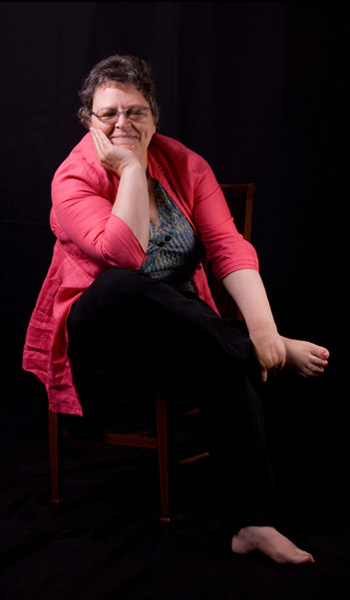
An image from my latest shoot.  Other images from this session appear in an earlier blog, but I like this pose, the interesting shapes made by the arms, and the drooping fingers.  Looking at this I find my gaze constantly moving from the eyes, down the model's left arm to the hand, where the highlight on the chair bounces it back to the index finger up the other arm to the face and eyes, and so on.  A major objective of a photographer is to get people to look at his photographs, and the longer, the better, and I think this is successful.

My problems.
Technique and technology still intrude in my studio portraiture.  I want to place more of the emphasis on the model, how she looks, how the light plays on her features, how she feels and behaves.  I have difficulty preparing for a shoot; I haven't got a satisfactory notation system to plan with, and poses tend to be ad hoc, and at the suggestion of the model.  With an experienced model this is often okay, but I struggle to direct an inexperienced or nervous one.

What I want to do.
The more I practise, the better I hope to get.  Familiarity with the equipment and situation will help me concentrate on the model and the effects of light.
I'm studying the work of other photographers, trying to understand how they obtained the effects they have, and also deepening my appreciation of portrait photography.
I intend to create a vocabulary of stock poses and lighting situations, documented in photographs, to assist in planning, and as a Plan B, for when imagination fails.
Inside and outside the studio, I want to develop more confidence in directing models and organising the session.  Practice will help here; I just have to get on and do it.

I'm very grateful to Carol, my model in all six sessions.  She's beautiful, confident and relaxed in front of the camera, which make my job much easier.   I hope to photograph her many times in the future, when my skill may perhaps improve until I'm worthy of her.

Wednesday 5 September 2012

The Shoot for Assignment One

This is a series of photographs I took during the final shoot for assignment one.  I was inspired by a series of Edward Weston photographs: Tina Reciting, 1924: http://ccp.uair.arizona.edu/item/14882, not so much by the images themselves but by the idea of getting the model to recite, to express her thoughts and emotions.  My model is an actor, so I was sure she'd remember something to recite.

Classic pose for remembering.

She begins, a little uncertainly...

but warms to her subject...

now she's really selling it...

the big finish...

the closing words...

 And we're done.  I've posted these images because I think they're a really nice sequence.  I haven't yet decided on my selection for the assignment, though the first and last here are contenders.  I'm very grateful to my model for lending me her time and beauty.

Tuesday 4 September 2012

Exercise 8: limbs

The chair's a little high for the Christiner Keeler pose.  The model's fairly relaxed.  The dark trousers vanish against the background, but I rather like the disembodied feet - need to black out the horizontal strut of the chair.  It's an effect I'd like to return to, but not appropriate for most portraits.


Relaxed, chin on wrist.  A useful pose with an older model who may not want her neck exposed.

The chair back's too high for this, forciong the model to tilt back her head.  The hands obscure the face. I think there's scope for making small adjustments to this pose, gradually getting it right.

Better.  The elbow is forward, supported by the upper arm, allowing the head to straighten.  Yet the forearm is closer to the camera and over prominent.  A lower chair back, or a table, would fix this.

Oh, all right.


Seated pose; what do you do with the hands?

Here, they're defensive and seem to be pushing down. It's fairly comfortable for the model, but emphasises their weight.

Her right hand's okay, but the dangling arm looks odd.  It was even worse when she tucked it behind her back.  Limbs have purpose; they do things; they don't just flop.  In the photograph they have much to contribute; they shouldn't be a problem.  Do something positive with them.

Better.  The model looks relaxed and comfortable.  The hands aren't doing much, but their position close the the centre of the body is comforting.

The knee's too high, the left arm looks uncomfortable.  This is not a pose the model would hold for very long; her left elbow isn't supported.

More comfortable.  The arms are forward, which rounds the shoulders, but she's confident, in control, but within herself.  I'm liking the lost edges, the missing legs and trousers, though they're not suitable for this exercise.  Clone out the chair and it's a very odd position!

The hands are prominent here, as is the foot - long lens required, to push them back.  The shoulders are better.   I keep using the word relaxed,but this position is just that - except for that disembodied foot pointing at the camera

A balanced pose and I like it very much as a composition.  There's a diamond shape made by shoulder, arms and shin, and a broad triangle from head to toe to the corner of her jacket.  She looks engaged, yet introspective.

I don't like this final pose so much as a composition, though there's something good going on with the way the viewer's eye flickers between the feet.  I intend to revisit these two in my final shoot for this assignment, tonight.

Sunday 2 September 2012

Photo Shoot for Shropshire Life

I've taken photographs informally at Shropshire Arts Society (SAS) events for a year or so now, and was pleased when I was asked to take photographs at the Official Opening and Preview of Art at Ford House, and exhibition of paintings and crafts donated by SAS members, in memory of Judy Townsend.

A couple of days before the event I had a phone call: could I take photographs for Shropshire Life magazine?  The two regular photographers were busy at opposite ends of the county but the society and social correspondent, Howard Franklin, hoped to put a double page spread in the magazine but needed photographs of suitable quality.  A bit nervously, I agreed.

It was interesting and instructive to photograph to order: head and shoulders, small groups rather than individuals or general views.  The first thing was to get a shot of the venue - or rather of the house of the venue's owners.  Howard selected groups to photograph, chose locations and took the names down: left to right, check spellings.  I did some direction and chatted to the models, more to put myself at ease.  He knew a lot of people and was able to distinguish the great and good from the hoi polloi - I'd have photographed the deputy mayor's chauffeur!

The location was the upper floor of an old brick-built barn, with exposed beams and whitewashed brick walls.  The paintings were hung all along the walls and illuminated by overhead tungsten lights.  Prominent paintings formed 'focal points' for groups.

The overhead lighting created problems because brows shadowed eyes, so I used fill-in on-camera flash for many shots, to get a little light in without flattening faces too much.  The light was stronger than normal room lighting, but even with ISO 800 and f3.5 - f4.5 (wide open on my 18-55 kit lens) I had speeds of 1/10 to 1/20 (down to 1/6 for some!).  I took 70-odd shots for a total of about 20 usable ones.  I don't yet know if any are good enough for Shropshire Life...

And I got to photograph actress Gabrielle Drake, who opened the event.


Exercise 7: focal length

I've known for years that close-ups present an unattractive, distorted view of a face, but I'd not conducted an experiment like this, moving through the full range of focal lengths available to me.  In looking at these I've learned that the emotional connection we get from a face is impacted by focal length.  The model is not only distant at a long focal length, she looks it. 
My image at 70mm (110mm) seems right; distortion is reduced but the model is still present in the viewer's space.  I suppose I shouldn't be surprised that this is about the old portrait lens standard: 105mm.

18mm on 1.6 factor sensor, (29mm full frame).  The face is very rounded, nose, chin and nearest cheek are oversize, while the other cheek and forehead recede.  A most unattractive view.  Maybe the security folk surrounding politicians and the like are there partly to ensure no one gets this unkind wide angle view.  The camera was very close to the model, invading her personal space.  Another model would have been intimidated by it.

20mm (32mm).  Still a distorted image, the face looks fat, the features out of scale.


35mm (56mm).  A little longer than the old standard prime lens (50mm) but still the face is round, the features distorted.  I might use this if I wanted to emphasise the model's humour - though she'd not think it funny.

43mm (70mm).  This is a usable length; the face looks fairly normal; this is how people look when you're talking to them.

70mm (110mm).  A satisfactory image; the features look natural.  This is how people look when you approach them, and a normal human distance.

96mm (150mm).  This is usable.  The face might be looking a little flat, now, though...

171mm (270mm).  I think the image is definitely flattening now.  It has the distant look that one sees on images of the author on a book's dust jacket.  It's not just the far-away look in her eyes.

250mm (400mm).  Even the model's steady gaze can't retain the connection with the viewer.

Saturday 1 September 2012

Diane Arbus

I saw her 'Untitled' [Arbus, Diane, Doon Arbus, and Yolanda Cuomo. Diane Arbus: Untitled. New York: Aperture, 1995] last week.  It contains photographs taken at residences for the mentally retarded 1969-1971. 
"Finally what I've been searching for." Diane Arbus
"...created out of the courage to see things as they really are, the grace to permit them simply to be, and a deceptive simplicity that p[ermits itself neither fancy nor artifice..."  Doon Arbus (daughter)

Some people see these images as voyeurism; a freak show.  We're told the Victorians visited lunatic asylums for prurient entertainment.  I disagree. 

The people depicted are people; they seem to be enjoying themselves; their costumes and poses are apparently for their pleasure.  The point of these images seems to me to be to show us the people we don't see, to bring them to our attention, to show to us that despite their difference, they are as human as we are, and worthy of the same respect.  To hide them away (or to hide away from them) denies them this right.

http://diane-arbus-photography.com/