Thursday, 28 February 2013

Exhibitions

The Photographers' Gallery


http://thephotographersgallery.org.uk/geraldo-de-barros-2
An exhibition of the photographic work of the artist Geraldo de Barros.  Monochrome: contact prints, distressed by the artist, plus prints of A4 or thereabouts.  The prints were given a lot of space and this reduced their impact, especially the tiny contacts, which seemed lost in relatively large frames.  The subjects were largely abstracted; my favourites were multiple exposures of roof members, creating a lattice, e.g. Abstraction, Sao Paulo Station 1949.  I was disappointed; they made very little impact on me.
http://www.guildindia.com/C.K.Rajan/Index.htm
C K Rajan: Overlaying of two contrasting newspaper or magazine images of Indian scenes.  "how economic modernisation creates strong social and cultural contradictions."  Three images appealed:  ruined four-storey concrete buildings overlaid with the out-of-scale head and arms of a model; a flooded street, with a petrol filler nozzle, seemingly adding to the flood; A four-by-four truck jammed into a room.
http://nwermers.webs.com/collages19982011selection.htm
Nicole Wermers: her statement: "an investigation into the urban experience and the way in which the design of two and three dimensional space constructs desire, and communicates emotions and power."  Collages comprising carefully selected and cut out magazine cut-outs, forming abstract images, often of humour and great beauty. 
http://thephotographersgallery.org.uk/ill-form-and-void-full
Laura Letinsky: statement: "The still life genre is unavoidably a commentary on society's material mindedness and the way images promote a kind of promise of attainability."
Studio still life photographs of paper cut-outs from magazines arranged on white surfaces.  Although the appropriated images incorporated were all flat pieces of paper, the result was three-dimensional.   In each photograph, the cut-outs formed only a small, central group, yet were not swamped by the broad white spaces surrounding them.  They suggested that the viewer had entered after an event had taken place, and that what remained was the residue.  The prints were large scale and made appropriate use of the gallery space.

The Estorick Collection

http://www.estorickcollection.com/exhibitions/
The main exhibition, of etchings by Giorgio Morandi, was of more interest to Suki the print-maker,  than to me.  Linked with it was a display of colour landscape photographs by the photographer Nino Migliori of the place where Morandi lived.  http://www.photographers.it/articoli/ninomigliori.htm  They were Polaroid photographs that had been distressed by the photographer, then printed at a larger size.  Some of the polaroids were on display, so that one could see two stages of the process.  The resulting images appeared three-dimensional; the ink and paint on the polariods seeming to float above the landscape.  The mixture of small and large images was reminiscent of the Geraldo de Barros display at the Photographers' Gallery, however I found the Nino Migliori photographs to be more interesting and accessible.

Peter Fraser at Tate St Ives

(Magazine review)
http://www.tate.org.uk/whats-on/tate-st-ives/exhibition/peter-fraser
Having read John Burnside's article A Liberation from the Ordinary in the Spring 2013 issue of TATE ETC, I would like to visit this exhibtion, though it's a long way.  Fraser finds the strange and beautiful in what are regarded as trivial and mundane.  It's a kind of photography that appeals to me very much.  To find the beauty in, say, a couple of random blue buckets, is a great talent, and a delight.  The fact that they're photographed at all suggests they're worthy of attention (Sontag), and study of the photograph confirms this.  Burnside says, "The real world is physical and immediate and nothing is ordinary, or trivial, other than the mindset that does not know how to see what is really there." (p 58)

Since starting this course I look at faces a lot more, and find them all interesting and mostly beautiful. I think this is a similar process; a matter of seeing, rather than just looking.


Tuesday, 26 February 2013

Exercise: Space and Light

Horsehay Village Hall

I chose this location because it can be seen under very different light sources: daylight, fluorescent tubes, tungsten stage lighting.  Horsehay Amateur Dramatic Society was rehearsing a play in the hall.

Daylight through Windows

The stage is unlit and dark.  White balance varies across the view because of light reflected from coloured surfaces.  Look at the (white) radiators.

Day and Fluorescent Lights

This combination makes white balance tricky but gives suffient light for the men setting out chairs for this evening's performance.  More light spills onto the stage.

Here's a closer shot of the stage.  The dark windows, right, will be backlit.

 It's interesting to get backstage and take shots including two or even three contrasting 'worlds'.
I'd like to claim that I included the blue bucket as a homage to Peter Fraser, but it and the blue chairs were just there.
http://www.peterfraser.net/?page_id=77

Some actors believe that centre stage, a third back from the edge, is a sweet spot, a place of power, where an actor can dominate the auditorium.  Here I'm standing nearer the back of the stage.
The blurred man with the ladder shows that at least someone is working.

Tungsten Stage Lighting 

Stage lighting, using over a dozen spots and floods, gives overall illumination of the stage for this dress rehearsal.  The auditorium is lit only by reflection.  The shiny laminate floor gives pleasing reflections which in performance will be masked by the audience.  I particularly like the ladder. 
 
The steps, right, will be removed for the performance.  The portrait on the wall, mid-right, is one of mine.  The lights are close to the stage, creating a steep gradient, front to back.
 
Here is the rest of the auditorium, lit only by reflected light.  Light off the floor and blinds gives a brown cast, which I have reduced.

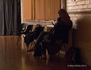
Here the contrast between the colours of different lights is an advantage. An image showing more of her face would have been good.

 Here are the lights.
I like the rich colour of the background here, which would be lost if turned to monochrome.
 
This exercise has been more interesting and challenging than I expected.  I've had to think and plan, put myself out.  For the daylit shots I took time off from my day job to attend while the auditorium was being prepared.  I had to re-edit, to fix white balance under different light sources, so that the three images of the stage shot from the rear of the auditorium matched, approximately.  Add light reflected from coloured surfaces, and the balance is a compromise.  ISO was mostly 3200; my Canon 60D and Photoshop cope adequately with this for much larger images than these.  I suppose the main lesson learned is that different lighting conditions can completely alter the look and feel of a location.


Monday, 4 February 2013

The User's Viewpoint

EightySix'd, Waterloo St, Ironbridge

https://www.facebook.com/#!/EightySixd.uk?fref=ts

Rooms are often constrained by the buildings that enclose them:
1, Waterloo Street, makes full use of a truncated triangular site and its shape determines that of the rooms.  The middle floor hosts a café with an artistic theme.  Artworks and objéts trouvés are displayed on walls and surfaces.
The platform at the narrow end is part of the structure of the building; space having been robbed to give headroom for the shop premises below.   If upright chairs were used here, their occupants could look down on the rest of the customers.  The extra height has been cancelled out and even turned to advantage by placing armchairs here.
This 'luxury' accommodation takes advantage of the view of the roundabout and the roads leading off it: up to the church; straight on the the Iron Bridge.

The homely mix of furniture is in keeping with the Bohemian atmosphere.  To replace it with something more stylish would spoil the feel of the place.
When it's full, it must seem pretty crowded, but that also is part of the atmosphere of the place, the feeling that art and ideas are more important that what one sits on.

The Woodbridge Inn, Coalport

http://www.brunningandprice.co.uk/woodbridge
Also in Ironbridge, this is a very different establishment
It's an old building (named for the previous bridge) that has had a thorough renovation, resulting in light and welcoming spaces.  Almost everything here has been designed to agree with the moderately olde worlde image the company wishes to project.  The gents' is an exception - well, no one wants to use an olde worlde lavatory.

 Modern, bright, shiny, with dark tiles below eye height balancing the white of the sanitary ware, it fulfils its function well and looks easy to clean.  The old pictures at eye level encourage the avoidance of introspection and carry the theme through from the rest of the pub, as do the wooden doors.